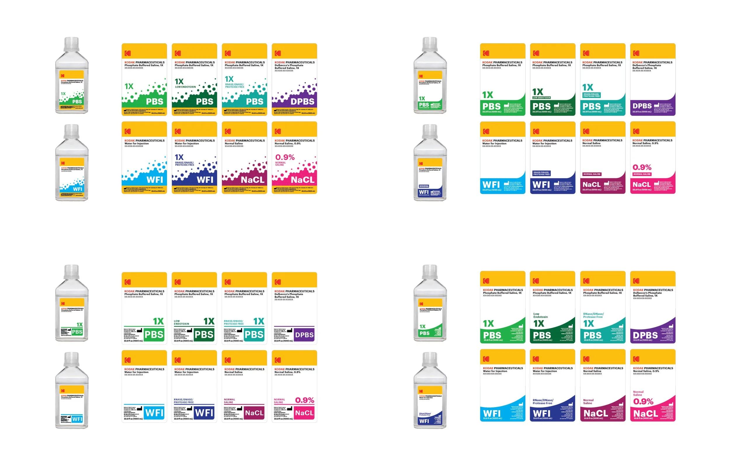
They wanted their lab solutions to be easier to tell apart at a glance.
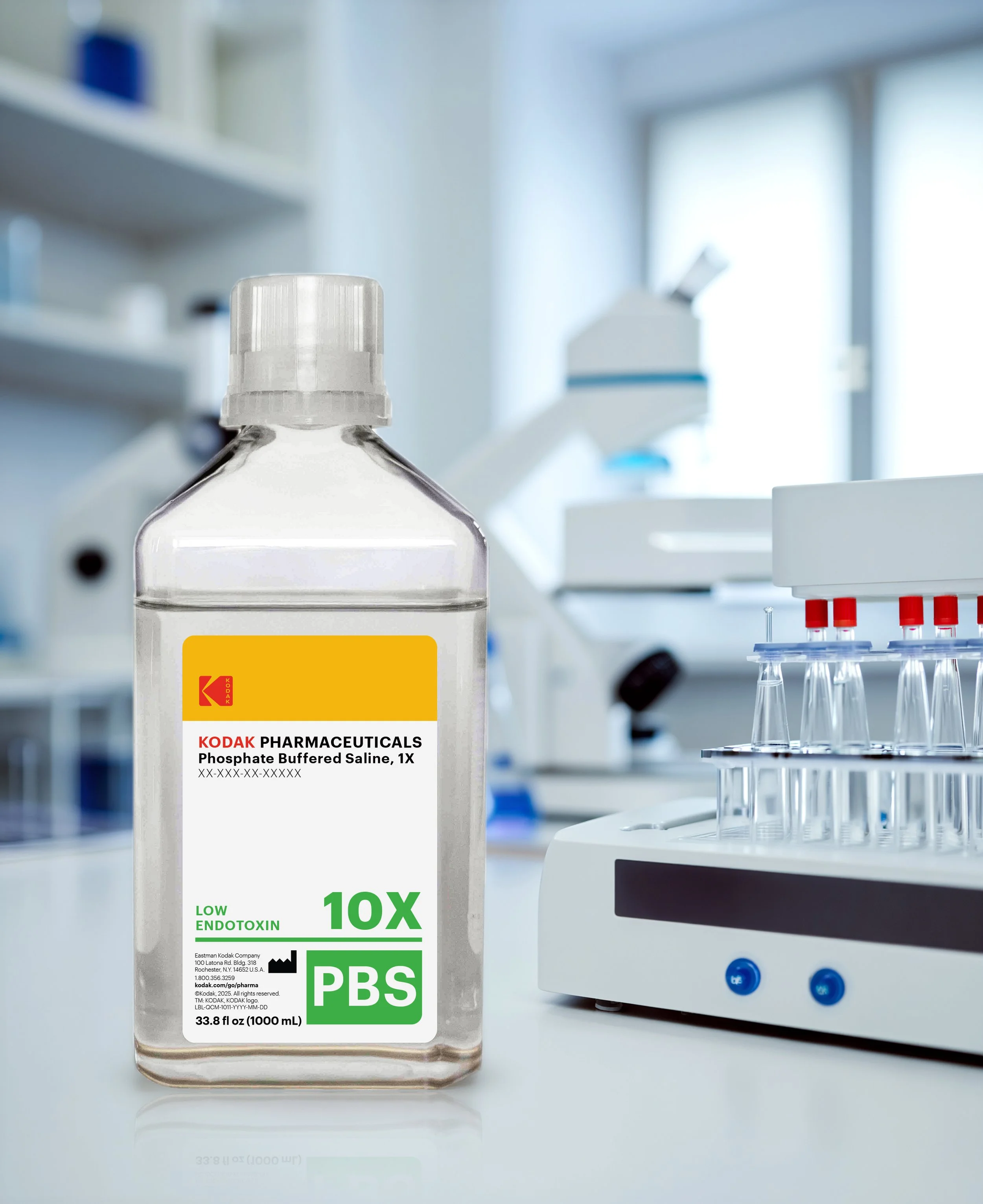
So I built a packaging system that gave each product a clearer visual identity while bringing the existing line in line with current Kodak brand guidelines.
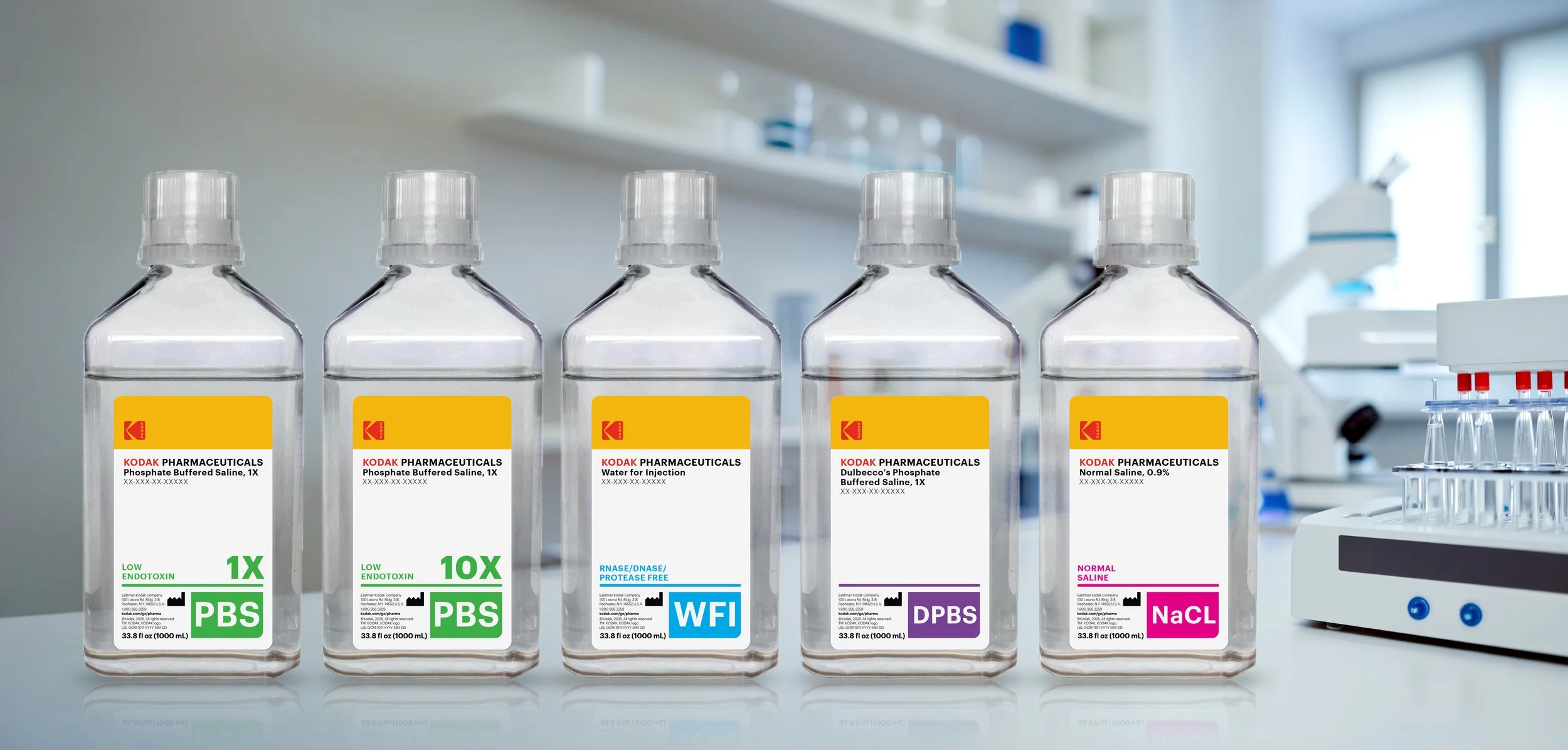
The challenge wasn't to reinvent the packaging. It was to make a practical system work harder. I created visual distinctions between products like PBS and saline while maintaining enough consistency across the line to make it feel like one family.
Focus
Packaging system design
Product differentiation
Brand guideline alignment
Information hierarchy
Outcome
A clearer, more cohesive packaging system that helps lab professionals quickly identify products while creating a consistent visual language across the line.